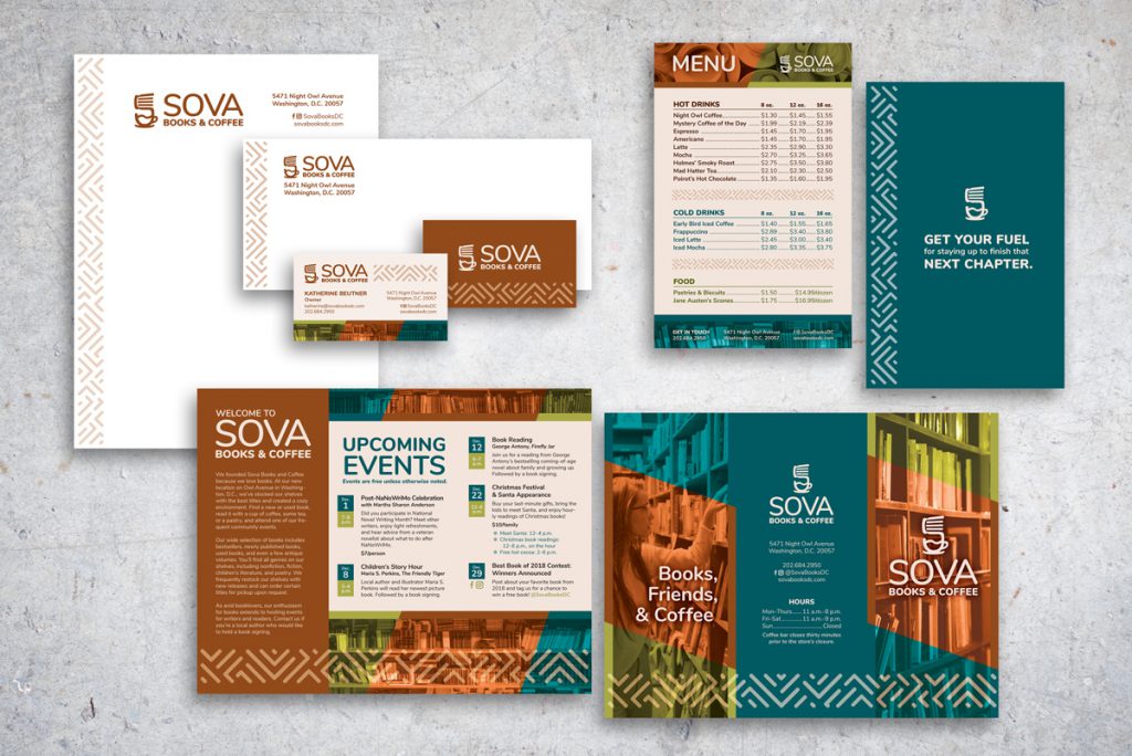
For this assignment, I created a visual identity for a fictional independent bookstore and coffee shop located in Washington, D.C. After doing a visual audit of different independent D.C. bookstores, I developed several logo concepts and then made five assets for the company.
Read my client brief below. View my process boards on Pinterest.
Software: InDesign, Photoshop
Dimensions:
- Business Card, 3.5″x2″
- Envelope, 9.5″x4.125″
- Letterhead, 8.5″x11″
- Menu, 5.5″x8.5″
- Brochure, 8.5″x11″
Design/Client Brief
Opening soon in Washington, D.C., Sova Books and Coffee will sell new and used books, magazines, and CDs. It will also maintain a small coffee shop and host community events. The company’s name comes from the Slovak word for “owl,” because the store is open relatively late for ‘night owl’ writers and readers. To stand out among local competitors, Sova is looking to create a logo, stationery, brochure, and another piece of marketing collateral.
The target audience includes literary-minded, upper- and middle-class people who purchase books (or are searching for a scarce or specific book) and enjoy attending community events related to books and writing. Some customers may be local, and some may be tourists due to D.C.’s many tourist attractions. Other customers may visit primarily to purchase coffee, but the bookstore is the primary element that should be emphasized in marketing. Events such as author signings, new book releases, writing lectures, and writing group meetings will also take place at the bookstore, so the marketing should reflect a feeling of community as well as an interest in books. Sova carries books for all ages and in all genres, but it is expected that an adult demographic is most likely to attend these events.
Many competitive independent D.C. bookstores, such as East City Bookshop, Mahogany Books, Pen & Prose, Walls of Books, Politics and Prose, and Solid State Books, have a coffee shop and host frequent events. Most of their logos have a one to two color palette of either black or warm colors (orange/brown). However, the logo styles among the six stores differ; three logos have flat minimalist illustrations, three have a handwriting/script or other quirky typeface or element, only two include book-related imagery, and three include serif typefaces. Most of the logos did not conform to the minimalist style with sans serif typefaces so common to corporations. Frequently, the bookstores’ visual identities are inconsistently implemented across their materials, so a consistent visual identity will help Sova gain an edge in the market.