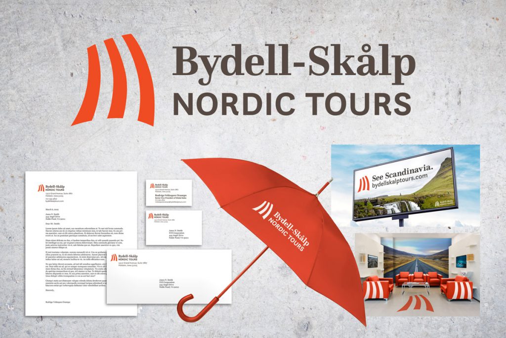
After being assigned an industry and a company name in class, I created a visual identity and a corporate campaign for a tour operator. My process is documented below.
Company Positioning
Bydell-Skålp Nordic Tours is a new tour operator based in the U.S. that offers ecotourist tours and outdoor excursions in Norway, Iceland, and Sweden. Core company values include providing friendly and professional service, ensuring sustainable operations, focusing on family-friendly tours, and encouraging guests to engage with genuine Scandinavian culture.
Step 1: Competitive and Visual Audit
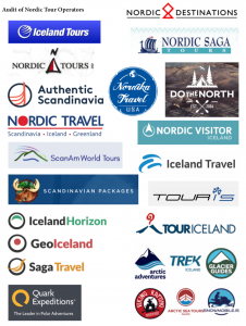
I studied the visual positioning of other tour operators that offered tours to Nordic countries. The best competitive visual identities were minimalist and sleek, with a restrained color palette. I took special note of the tour operators that emphasized Scandinavian culture and sustainability in their messaging.
Step 2: Logo Design
Development
I made 135 sketches of possible wordmarks, monograms, pictorial marks, and symbolic marks. Five merited development:

I eventually chose the middle design, a striped Nordic sail, but I spent a lot of time perfecting the shape and the logotype/mark balance.

Final Logo
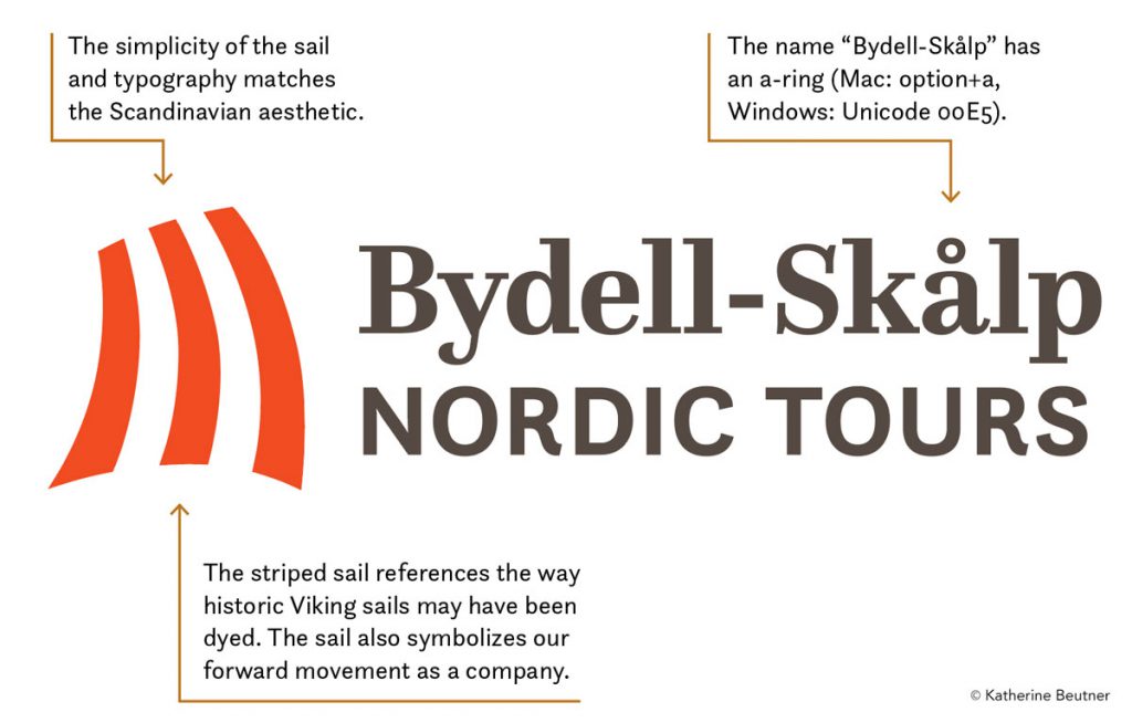
The final logotype includes the full name of the company, and the pictorial mark is a striped Nordic sail, reaching back to Scandinavian history and culture. The simplicity of the sail and typography matches a minimalist Scandinavian aesthetic.

Step 3: Business Suite
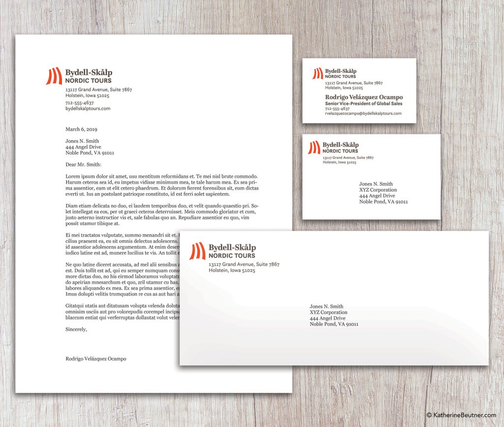
Clockwise from top left:
- Letterhead (8.5″x11″)
- Business Card (3.5″x2″)
- Mailing Label (4.25″x2.625″)
- #10 Envelope (9.5″x4.125″)
Step 4: Develop Ephemera
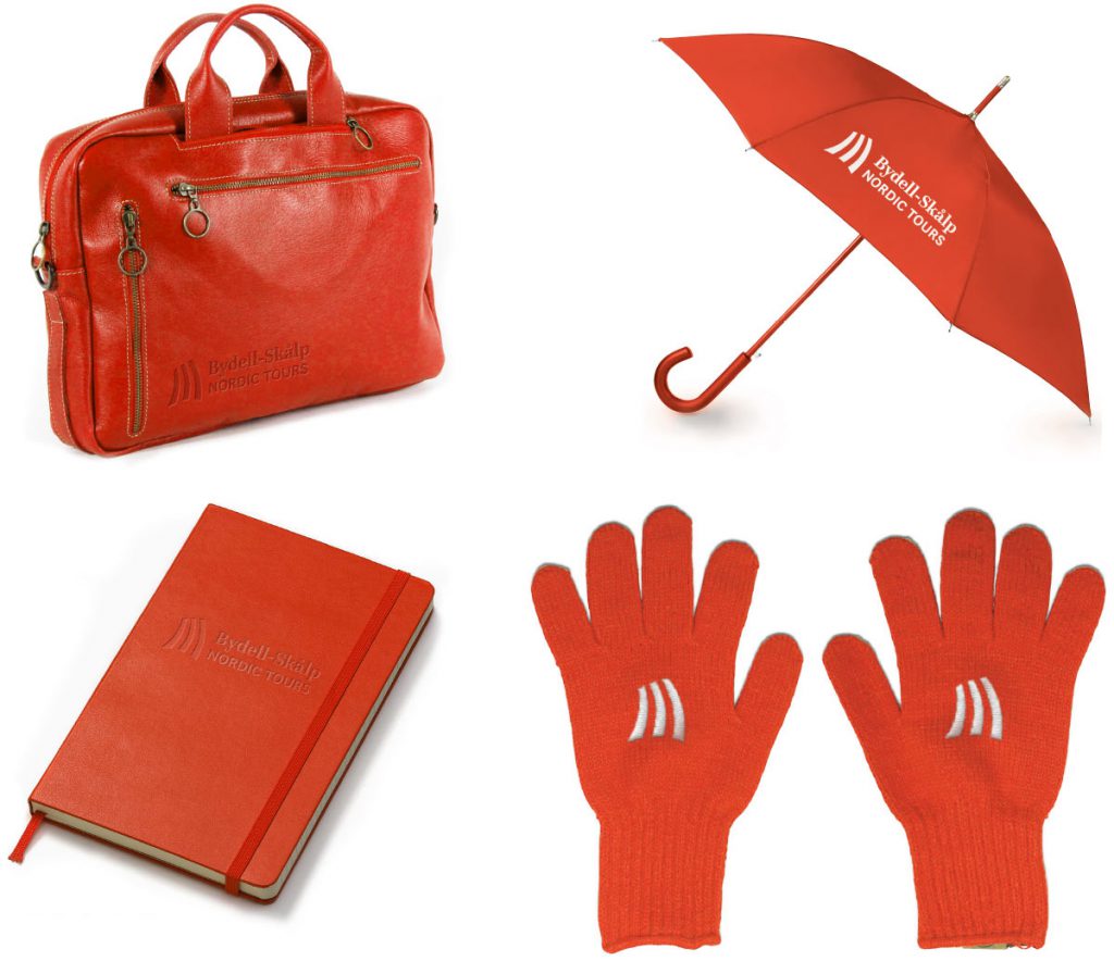
I made several mockups of different giveaway items that a tour operator might order as tchotchkes.
I ensured consistency for the colors of the items, and I made the imprinted, debossed, and embroidered logos look three-dimensional using Photoshop.
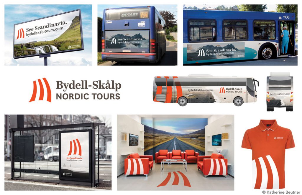
Step 5: Develop Collateral Material
A tour operator needs corporate collateral both inside and outside its offices.
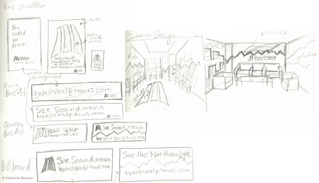
Outdoor advertising, including bus shelters, bus livery, bus king/queen posters, and billboards, would increase brand recognition for a tour operator like Bydell-Skålp.
I also worked on a polo shirt design and an interior design for the office lobby to convey the company culture and brand. These collateral materials would provide guests with a positive experience from their very first interactions with Bydell-Skålp’s touchpoints.
Initial Sketches
Final Collateral Designs
Step 6: Graphic Standards Guide
For more about the graphic standards guide I made for Bydell-Skålp, see this page.
All photos and mockups used under Fair Use for educational purposes.
- http://cdn.shopify.com/s/files/1/0155/9059/products/RedGloves2_2048x.jpg?v=1510833565
- http://www.duanealley.com/product-order/templates/0/red_notebook.png
- https://www.totes.com/products/images/xlarge/9302_BLK_xl.jpg
- https://www.rivercitygranitestl.com/fancy-leather-notebook/carrying-the-designer-laptop-bags-to-work
- https://graphicburger.com/bus-stop-billboard-mockup-2/
https://www.commercialinteriordesign.com/sites/default/files/cid/article_embed_images/Car-Showroom-3.jpg - http://freemockupzone.com/free-outdoor-advertisement-sky-billboard-mockup-psd/
- https://pixfeeds.com/images/25/554666/1200-153763923-bus-advertising.jpg
- https://oaaa.org/AboutOOH/OOHBasics/OOHMediaFormats/Queen-SizeBusPosters.aspx
- https://oaaa.org/AboutOOH/OOHBasics/OOHMediaFormats/Queen-SizeBusPosters.aspx
- http://cdn.paulsmith.co.uk/media/catalog/product/cache/1/image/9df78eab33525d08d6e5fb8d27136e95/p/k/pkpd-761m-951-r.jpg
- https://www.freepik.com/free-photos-vectors/design
- https://unsplash.com
